
Unburden
MOBILE APP DESIGN
PROJECT OVERVIEW
WHAT I MADE
A decluttering app prototype designed to guide users through the emotional and logistical challenges of reducing household clutter. The app helps users identify sentimental attachments, break down goals into manageable steps, and build routines for long-term success.
WHY I MADE IT
Survey and interview data revealed that clutter often stems from emotional sentiment and stress. Existing solutions lacked customization, community, and habit-retraining features—so I designed a tool to empower users with empathy, structure, and joy.
HOW I MADE IT
I led the UX process from research to design: uncovering user motivations, validating concepts through surveys and interviews, and crafting a mobile-first experience with customizable task flows, habit challenges, and community support.
DISCOVERY
People are accumulating more than they need. Some reports say that we consume twice as many material goods today as we did 50 years ago.
Studies show that Americans spend $1.2 trillion annually on nonessential goods, resulting in approximately 300,000 items in the average home. This leads to excess waste, environmental impact, loss in potential savings, and stress.
In order to design the best solution to the issue of excessive consumption and accumulation, I would first answer the following questions:
Why are people accumulating so many things, both emotional and rational?
Is there a trend in the items people tend to accumulate?
What are the current solutions to the accumulation problem? (ex. offsite storage), and what are the positive/negative aspects of these solutions?
What are the differences between the way families and single-person households relate to this issue?
RESEARCH STRATEGY
First, I conducted a review of existing studies on clutter and accumulation of non-essential goods in order to fully understand the potential user behaviours and trends. Secondary research to also conducted by collected information from articles and case studies to further identify industry standards and user expectations.

HEURISTIC EVALUATION
In order to gain more knowledge on how to improve the user experience, I conducted a heuristic evaluation of three apps—KonMari, Wunderlist, and Sortly—to identify usability gaps and inform the design of a proposed decluttering tool. Using Nielsen’s 10 usability heuristics, I assessed each app’s core workflows, interface design, and user empowerment features.
SCOPE OF EVALUATION
Tasks analyzed: account creation, item tracking, scheduling, reminders, sharing, and interface review
Heuristics rated by severity: Cosmetic (1) to Catastrophic (4)
Focus areas: User Control & Freedom, Help & Documentation, Aesthetic & Minimalist Design
KonMari app
Wunderlist app
Sortly app
KEY FINDINGS | HEURISTIC EVALUATION
| App Name | App Store Rating | Google Play Rating | Evaluation Summary |
|---|---|---|---|
| KonMari | 2.9 | N/A | Visually appealing but functionally rigid; major usability issues including crashes and lack of customization. Severe issues included app crashes, lack of customization, no undo/redo options, and only available on iPhone. * Rated with 3 catastrophic and 4 major usability violations. |
| Wunderlist | 4.9 | 4.6 | Highly intuitive and customizable; high ratings and intuitive design made it a strong organizational tool. Minor issues with reminders and subtask visibility were observed. |
| Sortly | 4.7 | 4.4 | Visually engaging and flexible; minor usability issues and feature limitations tied to subscription. |
SURVEYS + INTERVIEWS WITH POTENTIAL USERS
To better understand the emotional and behavioral drivers behind household clutter, I conducted a survey with 38 participants. The goal was to uncover patterns in accumulation habits, assess openness to digital solutions, and identify key motivations and barriers to decluttering.
RESEARCH PLAN
-
Why are people accumulating so many things?
Is there a trend in the items people tend to accumulate?
What are the current solutions to the accumulation problem? (ex. offsite storage), and what are the positive/negative aspects of these solutions?
What are the differences between the way families and single-person households relate to this issue?
-
Homeowner or long-term renter (in current residence at least 2+ years)
Identified an excess of items in their home
Expressed interest in learning more about decluttering and reducing nonessential items
Uses mobile apps multiple times per day
-
Participants: 38 individuals
Purpose: Gather demographic data, assess clutter levels, and gauge interest in a decluttering app.
Key Metrics:
Age, gender, living situation, length of residence
Self-assessed tidiness and item quantity
Frequency of mobile app use
Willingness to use a decluttering app
-
Participants: 6 selected from survey pool
Format: 15–30 minute sessions using a scripted set of 12 primary questions
Focus Areas:
Emotional attachment to items
Impact of clutter on daily life and social interactions
Current coping strategies and their limitations
Motivations and barriers to decluttering
Sentiment toward existing apps and digital tools
Based on the survey responses, I conducted follow-up interviews with six participants to explore the emotional nuances behind their attachment to items, the impact of clutter on daily life, and their reactions to existing solutions.
These conversations revealed deeper insights into the sentimental value of possessions, the stress caused by disorganization, and the desire for flexible, empathetic support in the decluttering process.
KEY FINDINGS
Clutter is common: 74% of respondents reported having “too many items” in their home, even though 58% rated their tidiness as “good.”
Emotional barriers: Many participants struggle to let go of sentimental items like letters, clothing, and craft supplies due to emotional attachment or guilt.
Clutter impacts lifestyle: 29% described their homes as “disorganized”, and 8% were “too embarrassed" to invite guests over.
Strong interest in solutions: 89% expressed interest in using an app to help reduce clutter, and 84% use mobile apps daily or multiple times per day.
Storage as avoidance: Common clutter zones include garages, basements, and spare rooms—often used to hide excess items rather than address them.
Motivations to declutter: Cleanliness, reduced stress, and preparing for future moves were key motivators.
INTERVIEW INSIGHTS
To deepen the survey findings, I conducted follow-up interviews with six participants. These conversations revealed that clutter is not just a spatial issue, it’s deeply emotional and often tied to identity, memory, and aspiration.
Emotional Attachment Drives Accumulation
Participants struggled most with letting go of sentimental items like letters, gifts, and clothing tied to specific memories or people. These objects served as emotional anchors, making decluttering feel like a loss.
“The thing I find hardest is unattaching the sentiment on things. I have letters from friends in high school still, boxes of concert stubs, the empty case for a mix tape a boy made me that the tape broke long ago.” — W.B.
Creative Potential and “Someday” Thinking
Books and craft supplies were frequently hoarded for their potential use, even if they rarely got used. Clothing was often kept “just in case”—for future sizes, occasions, or out of guilt for wasted money.
“I think my desire to attain things outweighs my desire or time to use them.” — M.B.
Out of Sight, Out of Mind
Common hiding spots included basements, spare rooms, and kitchen counters. While this kept clutter out of view, it often rendered parts of the home unusable and added stress when guests visited.
“It makes it harder for anyone to sleep over at our house with the spare room looking like it does.” — S.T.
Social Impact and Shame
Some participants avoided hosting altogether, while others admitted to last-minute cleaning frenzies before guests arrived. The clutter created a sense of embarrassment and isolation.
“No group get-togethers. I can invite people over as long as they agree not to go upstairs into the bedrooms and office, or downstairs into the basement.” — D.T.
Motivation: Cleanliness, Calm, and Control
The primary motivation for decluttering was a desire for a cleaner, more peaceful space. Clutter was described as mentally draining and a barrier to focus, especially for those working from home.
“Clutter stresses me out and makes it harder for me to concentrate when I am working at home.” — K.P.
SYNTHESIS
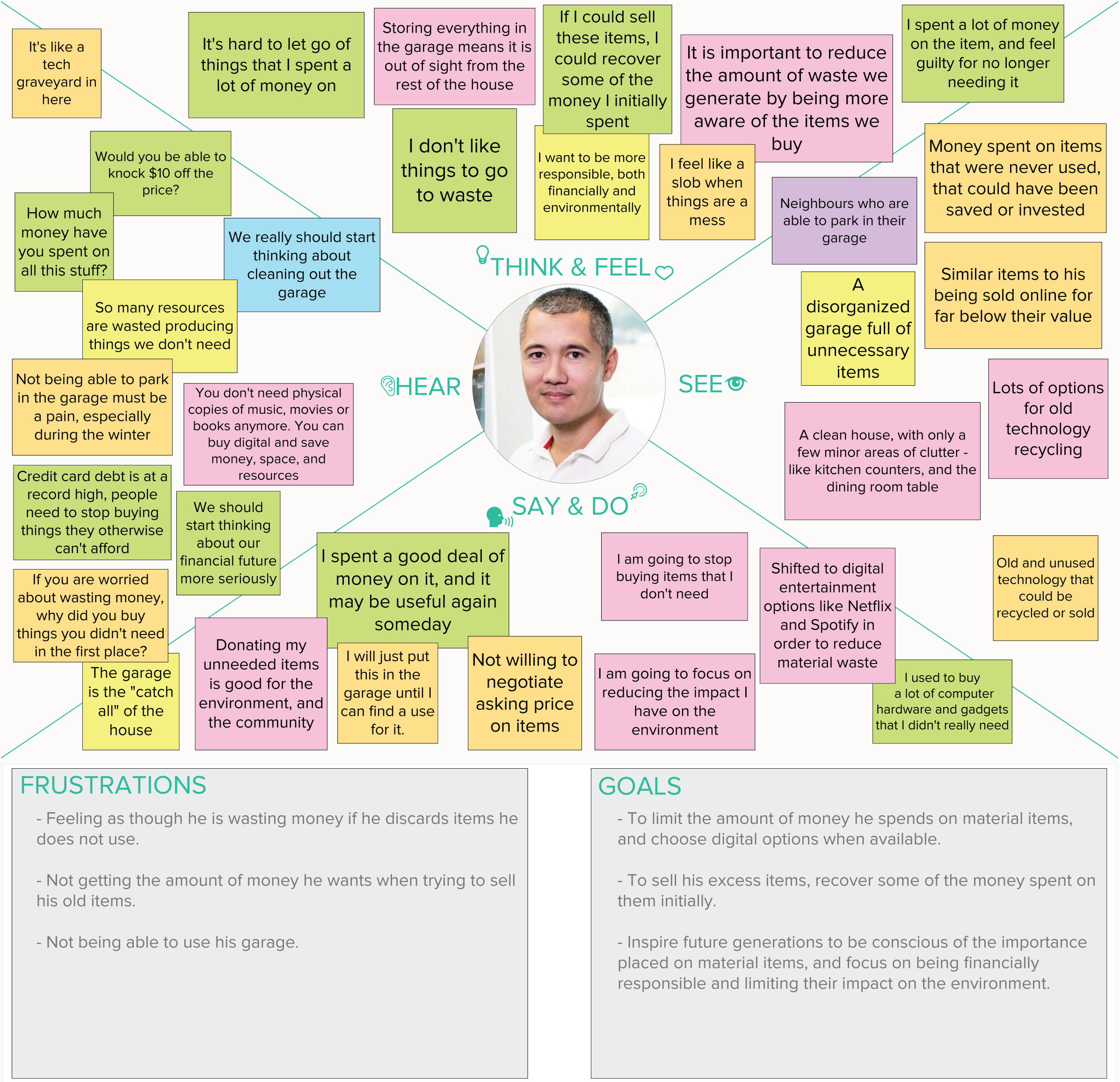
PERSONA DEVELOPMENT
Based on feedback from the respondents, both the reason for acquiring and keeping unnecessary items were emotional. The emotional connection to the items, as well as the fear that the item will be needed in the future were the biggest challenges faced when trying to discard excess items. Others indicated that they felt guilt when considering discarding items that were received as gifts. Respondents were also hesitant to discard items on which they had spent a significant amount of money.
Four personas were discovered during the research phase, with all participants demonstrating at least two of the aspects used to develop the personas.

"EMOTIONAL” EMMA
Wants advice on how to separate actual garbage from proper keepsakes.
Needs motivation to keep decluttering until she is able to feel at ease in her own home.

"NO TIME” NICK
Wants the decluttering process to be as organized, efficient and quick as possible.
Would like to schedule his tidying sessions the same way that he would a work meeting or a team practice.

"WHAT IF” WHITNEY
Needs to restrain her online shopping habit, as well as reduce her current wardrobe to just the items she actually uses.
Has difficulty letting go of items, fearing she will need/want the item once it is gone.

“MONEY-MINDED” MARK
Hesitant to discard items that he has spent a great deal of money to purchase.
Needs a plan to deal with a garage full of items he would like to sell.
EMPATHY MAPS & DETAILED PERSONAS


TESTING
Now that I had empathized with target users and identified their needs, I needed to define the solution. Based on the preliminary user research and resulting personas and user stories, I determined that the core feature set of the mobile app to be the following four features, as these features would allow the app to be deployed and still deliver customer value:
Create and customize lists
Track their progress
Sync tasks to their calendar
Share tasks with their friends and family.
The first step taken was to sort all necessary required information into categories. Once these categories were finalized, they were used at the basis for the Card Sort study.
CARD SORT STUDY
An open card sort was conducted in order to help create an intuitive navigation system for the app. Individuals with similar goals and motivations to those of the identified personas were selected to participate in the online exercise.
Some of the tasks were easily grouped, such those related to notifications, settings, and decluttering tasks. While other items, like ‘restarting the decluttering process’, and saving difficult to discard items to a specific category, seemed to cause participants some trouble. Though the participants could not necessarily agree on the placement of these specific features, the heuristic evaluation did show that these two functions were important to users.
Some differences between the categorization of specific decluttering tasks were also noted, with some participants grouping all decluttering tasks together, and others grouping some tasks in their ‘progress’ or ‘settings’ groups. The users created an average of five groups:
Tasks
Progress
Account Settings
Notifications
Items
SITE MAP
A site map was created based on the card sort results, with data from the preliminary studies being used to decide between the minor discrepancies observed in the card sort results.
Though, the terms “tasks” and “tags” came up frequently during the card sort process, these names were a source of confusion later during the usability testing phase.
As a result, the menu name was changed to “Lists”, and the “Tasks” and “Tags” headings were updated to “Rooms” and “Categories” respectively.
INTERACTION DESIGN
In order to maximize how efficiently users could navigate through the decluttering assistance app, it would need to be determined what they would need to see, and where would they need to go from each decision point.
User flows were generated for the following tasks:
New user registration
Add a new task to the “To-Do” list
Add an item to the “Do It Later” list
Share a task with a contact


PRODUCT DESIGN
WIREFRAMES
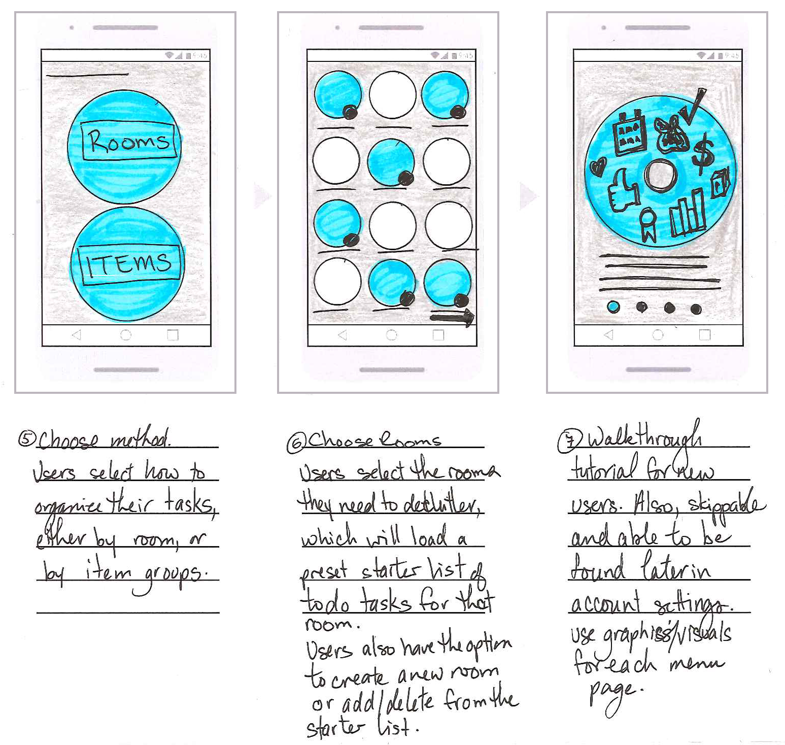
A series of basic sketches and wireframes were developed based on the user flows. As per the card sort findings, the primary categories were:
Progress/Dashboard
Lists (Rooms/Categories)
Notifications
Account Settings
As a result, these categories were all placed in a dock menu along the bottom of the app for immediate access. Placing the menu along the bottom also makes one-handed navigation easier for the users. Once the rough sketches were completed, the drawings were recreated and refined digitally in Adobe XD.
ROUGH SKETCHES
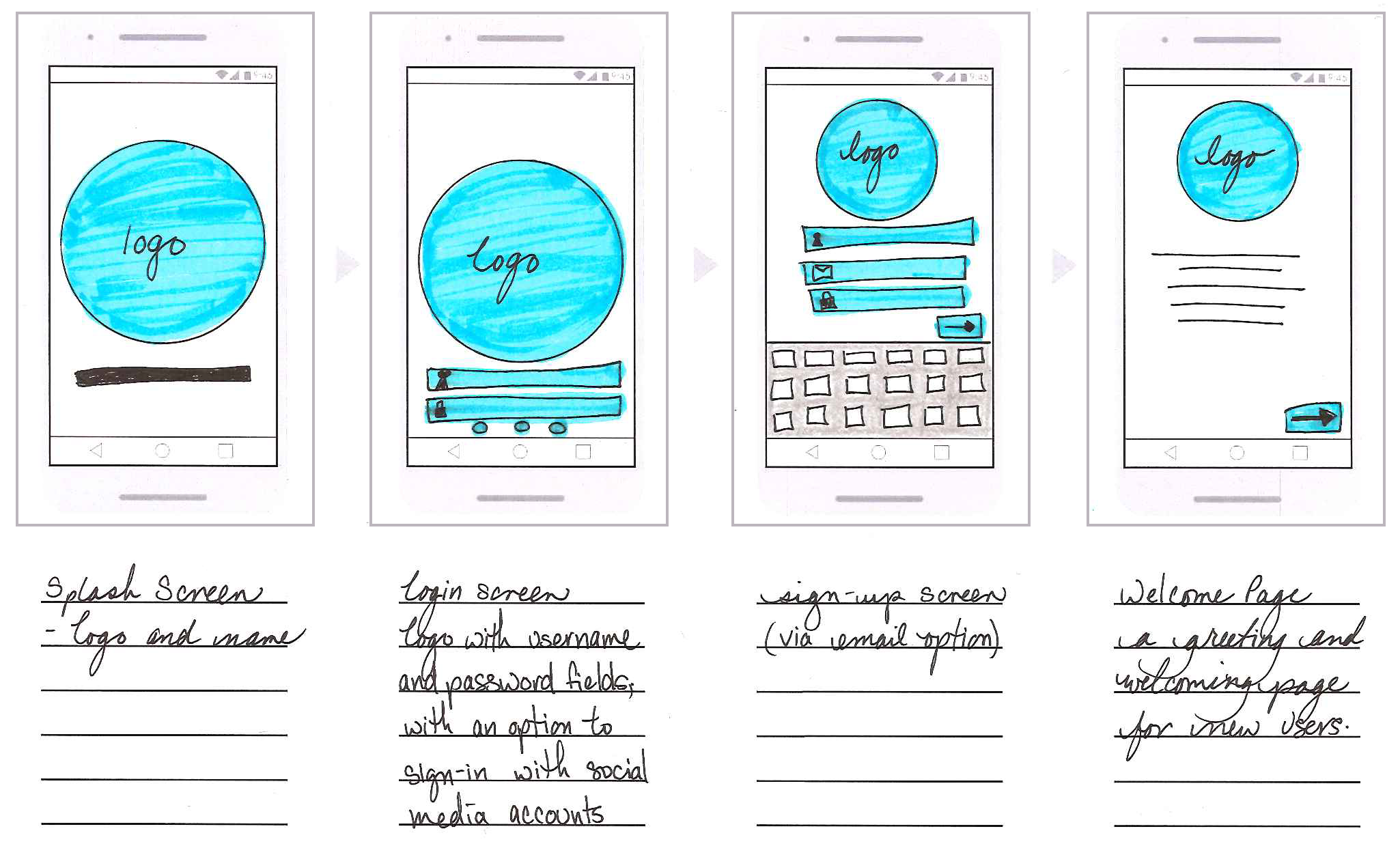
LOW-FIDELITY WIREFRAMES


VISUAL DESIGN
The overall visual design of the app is clean, light and uncomplicated in order to represent the sentiment of decluttering. The app was named ‘Unburden’ to epitomize the act of freeing the user from their unnecessary material items, as well as the feelings of stress and guilt associated with the clutter.
Circles were prominently used in the design for Unburden due to their ability to create a sense of flow and calmness, as well as their representation of completeness and commitment. The colour choices are primarily neutral, with the yellow providing a subtle, yet sunny, pop of colour.
A feather was selected to represent the ‘Unburden’ app for its connection to freedom and inspiration, and it was turned upward to project feelings of optimism as well as to resemble a smile.
VALIDATION
The decision was made to elevate the original low-fidelity wireframes to medium-fidelity wireframes for the usability testing sessions.
Testing the product and its design while still in a rough form proved to be beneficial for many reasons. This direction would resolve any usability issues before spending time on a detailed and polished prototype. Also, studies have shown that participants are more likely to provide constructive criticism and feedback when presented with design that is still in the early stages.
Content and visual elements were added to more accurately represent the final product. The prototype provided limited functionality, but contained clickable hotspots to characterize the interactions and navigation possibilities of an application.
USABILITY TESTING
To ensure the usability of the current design, a usability test was conducted via moderated sessions lasting approximately 45-minutes with four (4) participants. Participants ranged in age from 28 and 44, with three users being current homeowners and one user currently renting. Professions of the participants included a civil engineer, an IS specialist, a drafting technician, and a project manager.
All participants frequently use mobile apps and are confident and comfortable using technology for both personal and professional purposes.
Prior to starting the testing, participants were asked about their expectation of a decluttering assistance app. The expected features that were mentioned was the ability to track progress, the ability to take photos of items and progress, as well as links to local junk removal services.
Participants were asked to test a click-through prototype and complete the following tasks:
1. Registering as a New User
During the testing sessions, participants commented that:
The “Register” button would be a little clearer if it was labelled “New User” or “Sign Up”
Social media icons should be grouped with the login fields, rather than below the sign-up functions.
The next step asks users to select the rooms in their homes, this step is intended to populate the “To-Do Tasks” menu and pull in the pre-loaded starter list of tasks to help Users by giving them a starting point.
Testers found this page to be overwhelming, with too many unnecessary options. Testers were also unclear on how to deselect a room.
2. Adding a New Room
All participants were able to successfully complete this task without issue.
Most participants stated that they liked that the new task was placed at the top of the list. One participant did comment that they had no real preference for whether new tasks are at the top or bottom of the list, just that it not be sorted in among the existing tasks.
3. Adding a Contact to a Task
Again, all participants were able to successfully complete this task.
Participants did identify that the ability to uncheck a contact from the confirmation screen would be preferred over cancelling out and returning to the Contacts page.
4. Scheduling a Due Date to a Task
Participants were able to successfully complete this task, and set a due date for the task
TESTER FEEDBACK
The majority of the feedback received from the participants revolved around the “To-Do Tasks” List and the ”Do It Later” Items Lists. Most participants felt that the task buttons were too small and would benefit from more interactivity. Another participant felt that the “To-Do Tasks” list and the “Do-It Later” items names were confusing. Other minor issues were that the testers found the “Room Selection” page to be overwhelming, with too many unnecessary options.
No issues were observed during the “Create a new room”, or Set a due date for the “To-Do” tasks. Participants also noted that the contact and calendar icons on the task tile indicating these fields had been set was a very helpful and communicative feature.
After completing the specified tasks, participants were asked to provide general comments regarding the app and their initial experience with it. All participants liked the icons on the task that indicated a contact or due date had been added to the task. They felt this feature was very helpful and communicative.
It was also determined that the app should contain plenty of customization options as limiting a users’ ability to adapt their course of action may be discouraging, especially if they feel as though they have gotten off-track or failed.
FINAL ITERATIONS
Based on the feedback and observations obtained during the usability testing sessions, several iterations were made to the design.
Menu and button sizes were increased to make navigation easier, and reduce the risk of frustration with not being able to interact effectively with small buttons. Increasing the size also allowed for changing the bullet list of tasks to clickable check boxes.
The ‘To-Do’ Tasks and ‘Do-It Later’ menus were changed to ‘Rooms’ and ‘Categories’ giving users more freedom as the app would not require them to commit to one decluttering style. This change also eliminates need for the overwhelming ‘room selection’ screen during the registration process.
Changes were made to the Rooms menu, in order to communicate additional information behind each room tile. This was done by adding an additional line of text that specified the number of unseen tasks, for example “...plus 12 more tasks” within each room or category. This indicator would also tell the user that there is more information available to view.
These simple iterations elevated both the functionality and usability of the design, as well as improved the overall aesthetics of the interface.

Aside from the visual interface, the ability to set goals, identify bad habits and the motivations that had contributed to the initial clutter as well as keeping users encouraged would be crucial to success of both the user and the mobile app.
Education and strategies that aid to prevent the accumulation of more unnecessary items and separate emotions from objects during the process, and in the future were recommended to be implemented and executed in a subsequent update.
UPDATED SCREENS


KEY
TAKEAWAYS
I designed and validated a mobile decluttering app prototype that empowers users to overcome emotional and logistical barriers to clutter reduction. This capstone project was completed independently as part of an online UX boot camp program, with weekly mentorship check-ins providing strategic guidance and feedback. The project spanned an end-to-end project, with comprehensive UX research, persona development, heuristic evaluation, wireframing, validation and usability testing, and iterative design refinement.
Key Achievements:
End-to-End UX Execution:
Independently led a mobile-first decluttering app from concept to prototype as part of a UX bootcamp capstone, supported by weekly mentor check-ins.
User Research & Strategy:
Surveyed and interviewed 44 participants to uncover emotional and behavioral barriers to decluttering.
Synthesized insights into four actionable personas that shaped feature prioritization and design tone.
Design Systems & Interaction:
Created intuitive task flows and wireframes optimized for one-handed use and emotional clarity.
Refined navigation and terminology through card sorting and usability testing.
Usability Testing & Iteration:
Conducted moderated tests with diverse users.
Implemented key improvements—renaming menus, simplifying task creation, and adding progress indicators—to enhance clarity and reduce friction.
Behavioral Design Impact:
Embedded habit-building tools and emotional support features to drive long-term engagement and reduce re-accumulation.
Proposed scalable enhancements for future releases.
LESSONS LEARNED
As part of my UX bootcamp capstone, I independently led a full-cycle design project, guiding it from initial concept through research, prototyping, and usability testing. Working within a self-paced structure challenged me to manage shifting priorities and time constraints while staying focused on what mattered most. I learned how to break down complex requirements, identify core user needs, and make strategic design decisions with limited resources.
Usability testing was especially formative. At first, guiding participants through tasks felt a bit awkward, but having a clear script helped me stay grounded and focused. One of the most valuable lessons I gained was learning to listen without defending. There were moments when I wanted to explain the rationale behind a design choice, but I held back and let the feedback speak for itself. That restraint gave me deeper insight into how users truly experience a product and how much clarity can come from simply observing.
One of the more challenging design pivots involved the dashboard. My initial layout tried to show everything at once, which quickly proved overwhelming and ineffective. Through testing and iteration, I landed on a carousel-style menu that allowed users to cycle through their progress, schedule, and achievements in a more digestible way. It was a humbling reminder that simplicity often delivers the most impact.
Throughout the process, I was deeply grateful for the support of my mentor. Their thoughtful feedback and steady encouragement helped me stay accountable and grow with confidence. This project not only strengthened my UX skills, it also deepened my appreciation for the craft of thoughtful, user-centred design.
OTHER WORK
-
![]()
MANULIFE VITALITY
Website redesign
Redesigned the customer-facing Manulife Vitality microsite to support the high-profile “Go Big” launch. -
![]()
PLANEASY
Feature Integration: Authenticated Profile Hub
Designed a centralized hub for users to manage personal data and financial documents within the existing brand and site infrastructure.
-
![]()
GHD DIGITAL
3D Data Visualization Models
Generated interactive data models depicting raw environmental data to support engineering teams with visual data-centric solutions.


